Solenne Skin Studio
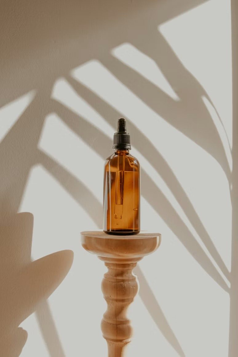
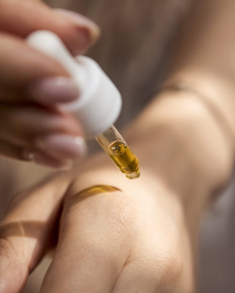
A calm, high-end studio with a website that looked like a discount clinic. We made the site feel like walking in.
- Business
- Med spa
- Starting point
- Website didn’t match the studio
- What we made
- Website redesign, treatment menu, online booking
- Timeline
- 2 weeks · Standard
The projectMed spa
Where they started
The situation
Solenne’s old site used bright stock photos, a crowded price list, and pop-up coupons. It looked nothing like the quiet, beautiful studio clients actually visited, and new clients assumed it was a discount clinic.
What we did
What we made
- A calm, editorial design that matches the studio itself
- A clear treatment menu with starting prices and durations
- Online booking for consultations and repeat treatments
- A memberships page, their most profitable service
- Short treatment pages that answer the questions clients are shy to ask
On a phoneWhere most customers see it
What success looks likeMeasured after launch
What we’d measure.
These are the goals we set for a project like this, and how we’d track them after launch.
Consultations booked
New-client consultations booked online instead of by phone or message.
Memberships
More clients moving from one-off treatments to monthly memberships.
The right first impression
Fewer price-shoppers, more clients looking for quality.
Start hereTaking new projects now
Have something worthgathering around?
Let's talk
EmailCampfireCollectiveStudio@gmail.com
Phone(848) 207-4011